A strong brand exudes everything the company has to offer and always has a stand-out icon with pulling power. This is why sometimes we have to reset brands with a new image and this is what we did for our client. MSP Easy Tools are a ground-breaking, innovative company who have developed a suite of software tools. These tools help make businesses run efficiently and support their office needs. But you wouldn’t think this if you looked at their original brand identity.
Challenge
The old ID was a complete misfit alongside the key messages MSP Easy Tools were trying to convey. It certainly didn’t reflect the industry and cutting edge software that our client has developed. MSPs (Managed Service Providers) purchase their software and then white label it to sell on to their customers. It’s therefore critical that these buyers feel confident that MSP Easy Tools can deliver a first class, problem-free service.
Solution
We knew our focus had to be on creating a strong icon. It needed to grab attention and appeal to our client’s target audience. So we chose to use a graphic ‘eye’. This symbol represents the insights MSP Easy Tools offer to a business and the clever solutions they create. The ‘eye’ graphic clearly dominates the new logo for a reason. It projects the right message and draws you into the brand. It sits proudly within the design and fits naturally across multiple media which is all part of the brand development process. Our graphic design team also produced powerful key messaging, graphic icons and engaging audience photography. This really brings the brand to life.
Results
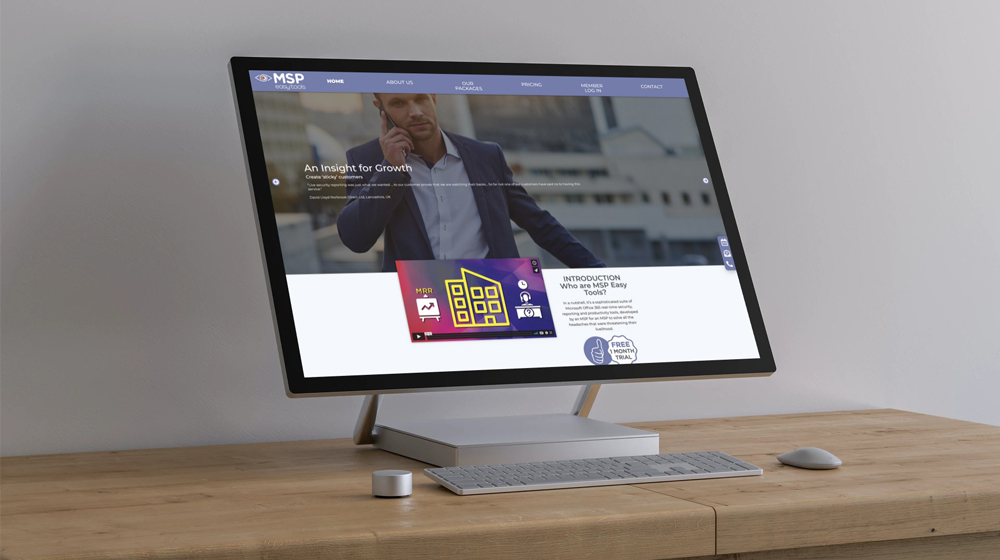
Since then new branding has been rolled out across various marketing channels. This includes a fresh new website with video/animation content and a social media campaign. The identity now represents a forward thinking, ‘finger on the button’ company. The new ID also reflects our client’s core value which is to provide insightful business solutions for customers.


